Brand identity
A brand people recognize on sight.
We design the logo, color, type and guidelines, then carry them onto your website, your print and everything else your customers see.







What you get
A full identity, not just a logo.
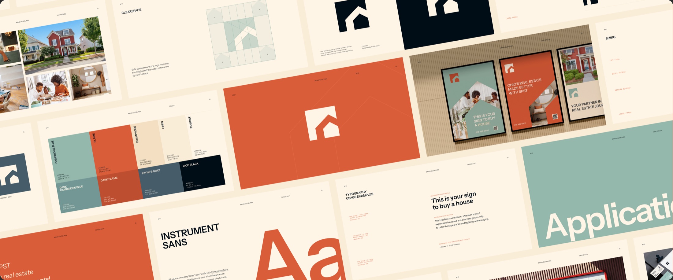
Every piece is built to work with the others, and documented so it stays consistent after we hand it over.
- 01
Logo system
A primary logo and a symbol-only mark that hold up on a sign, a website and a social profile icon.
- 02
Color palette
Primary and supporting colors with exact values for screen and print, plus the pairings that stay readable.
- 03
Typography
Typefaces and a type scale for headlines, body copy and labels, with the settings written down.
- 04
Brand guidelines
One document covering clear space, sizing, color use and type, so everyone who touches the brand uses it the same way.
- 05
Print and applications
Business cards, brochures, flyers, posters, signage and merchandise designed in the new identity.
- 06
Voice and copy
Taglines and messaging that sound like the brand looks, ready to use on the site and in print.
Case study
REsource Property Sales Team
- Branding
- SEO
- Copywriting
- 2023
A real estate brand for Northeast Ohio, built to stand out from the competitors around it.
Made for
- House buyers and sellers of a younger demographic, who have just started or are about to start a family in Northeast Ohio.
- Outgoing, progressive, newly licensed real estate agents who need access to a wealth of compiled resources for their development and success.
-
 01
The mark
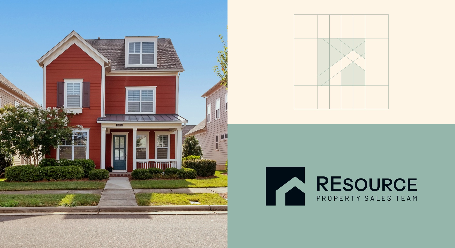
In the logo design process it was important to find a unique mark that would help the team stand out among existing competitors, and that could be used with the wordmark or on its own across online, print and social media.
-
 02
On its own
The symbol-only logo is used wherever the primary version would not be recognizable at that size, such as social media profile icons.
-
 03
Business cards
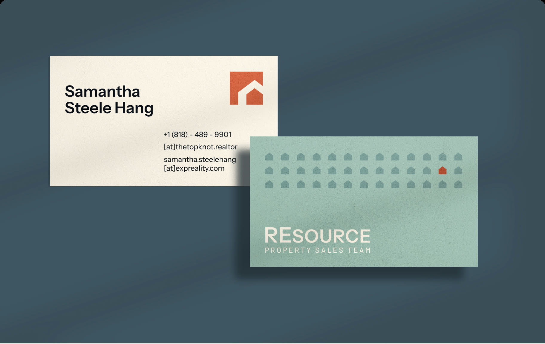
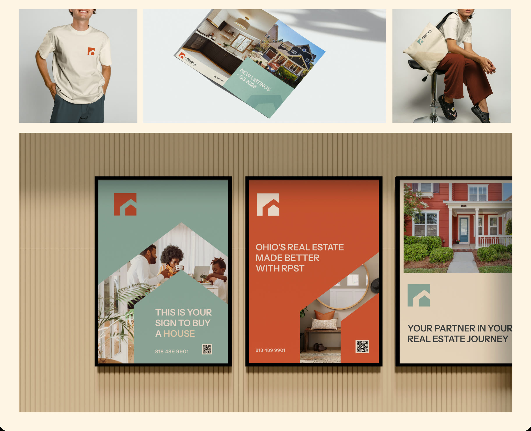
The business card pairs a cream front with a Cambridge Blue back, patterned with the house symbol.
-
 04
On the street
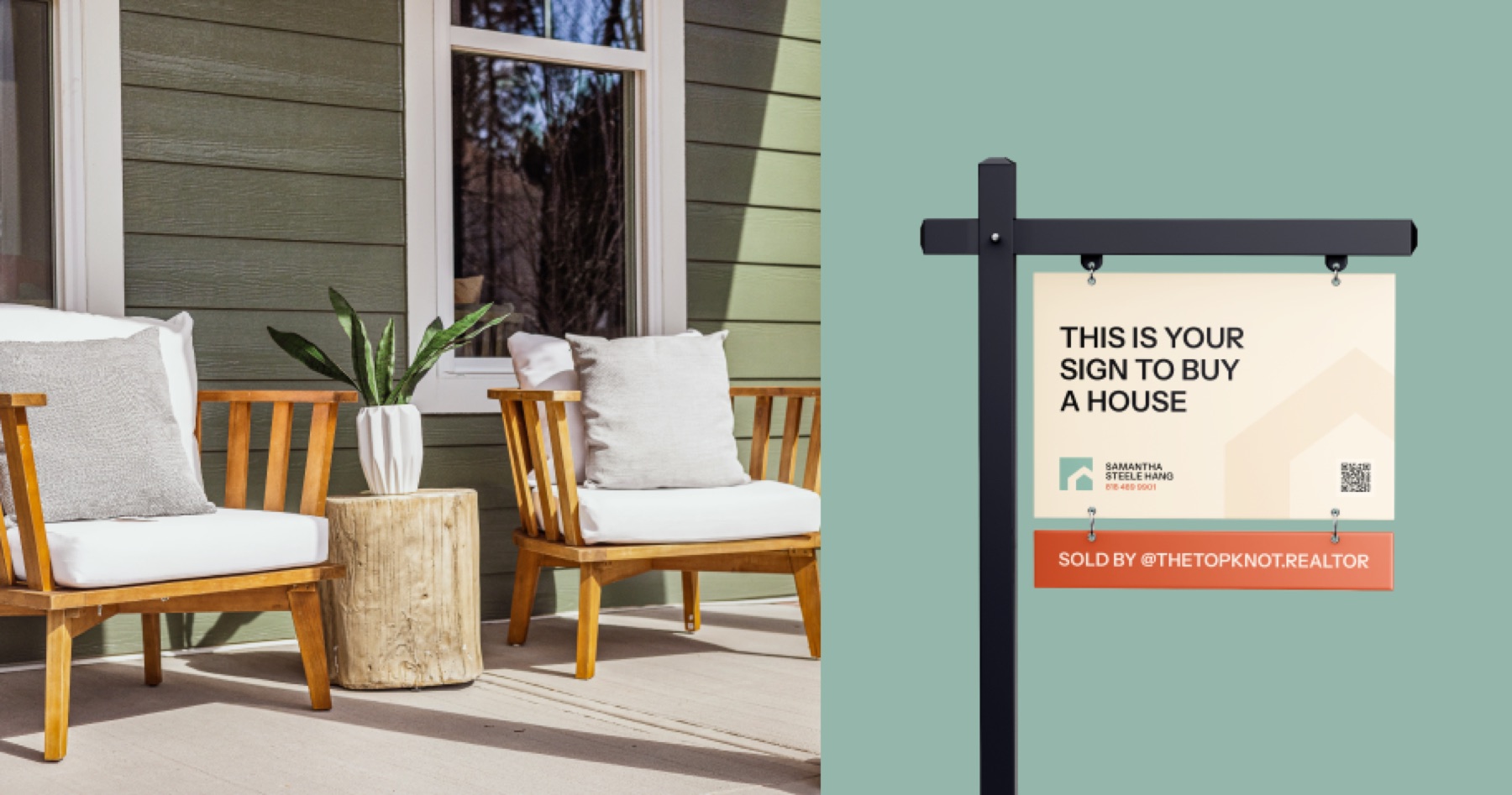
Yard signs carry the same colors, type and mark as everything else, so a listing is recognizable from the road.
-
 05
In print
We designed the printed materials: brochures, flyers, posters and merchandise. The typeface is Instrument Sans, a geometric sans-serif that balances precision with subtle notes of playfulness.
- Payne’s Gray #465C69
- Cambridge Blue #95B7AB
- Powder #FFF5E6
- Linen #FAEDD7
- Champagne #F3DFC1
- Flame #D95D39
Color palette
The palette features a vibrant burnt orange and a serene shade of teal as primary colors. The supporting colors are soothing, creamy off-white pastels and a muted navy blue with a hint of gray.
Case study
Waking Digital rebrand
- Branding
- SEO
- Copywriting
- 2023
Our own identity, rebuilt for an agency doing organic marketing and SEO, web design and web development.
Made for
- Growth-focused startups and mid-market businesses that want to scale through Webflow, SEO and AI automation.
-
 01
The mark
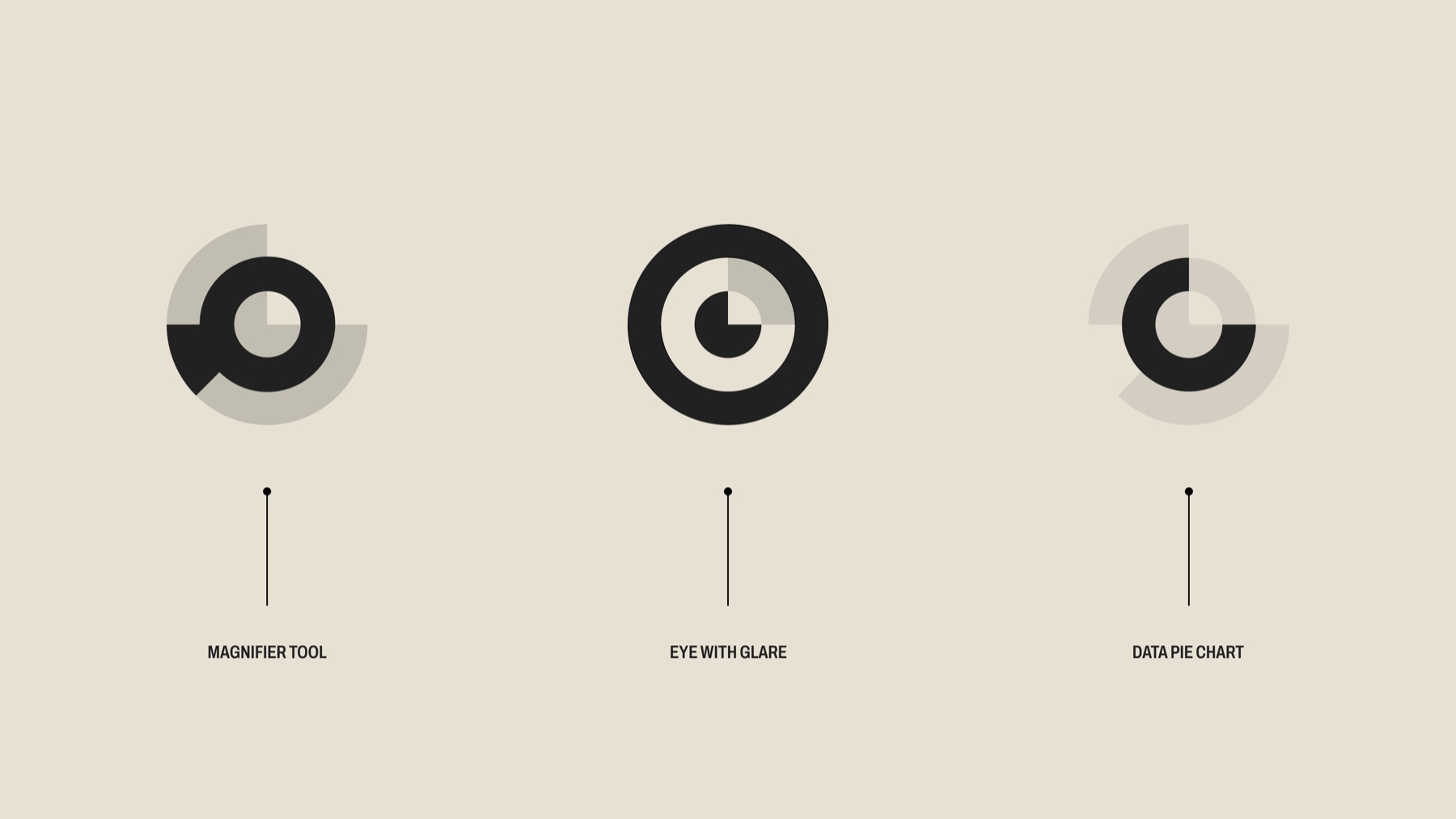
One symbol that reads three ways: a magnifier tool, an eye with a glare and a data pie chart. It works with the wordmark or on its own.
-
 02
Typography
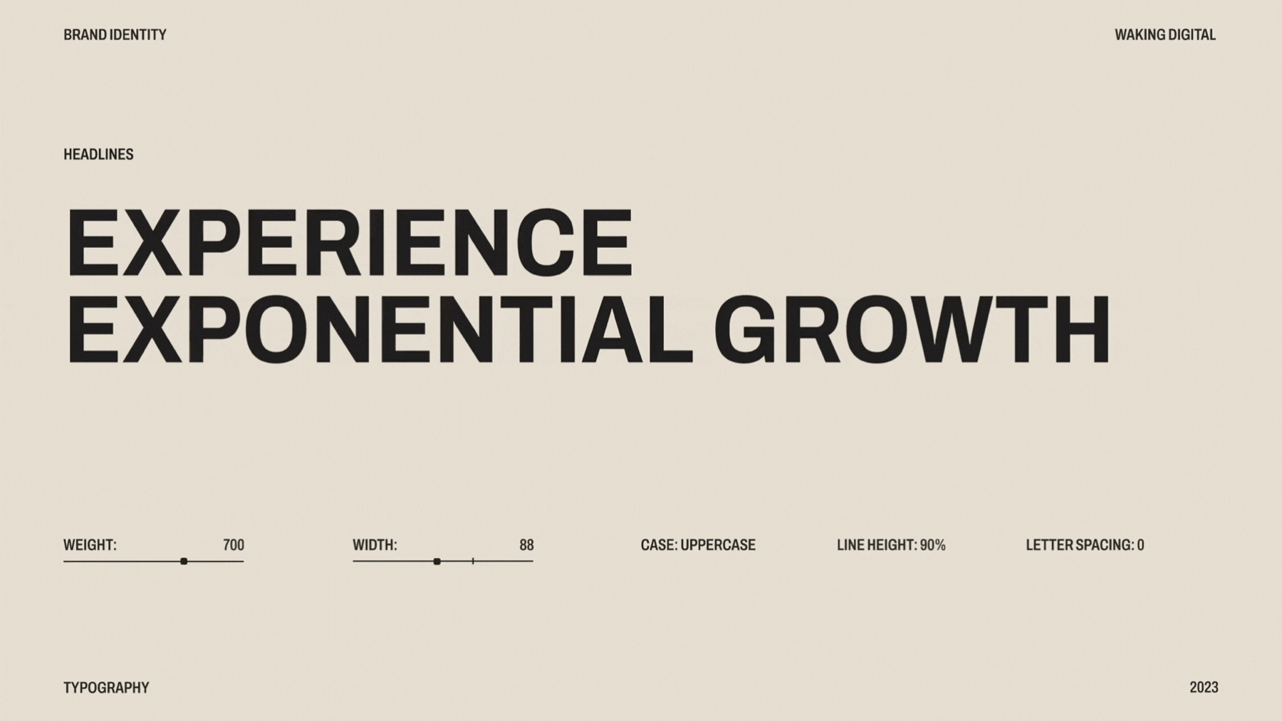
Headlines are set in uppercase Archivo at weight 700 and width 88, with a 96% line height.
-
 03
On screen
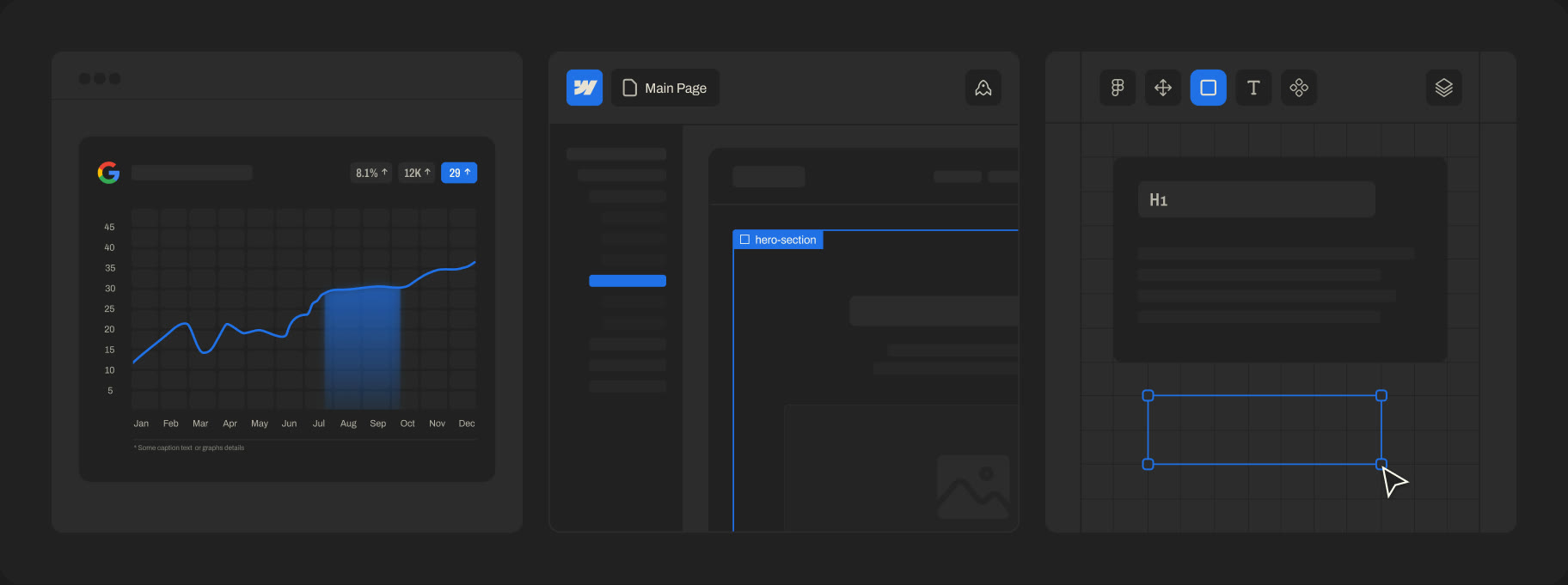
A set of interface graphics drawn in the brand’s colors and grid, used across the website.
-
 04
In the hand
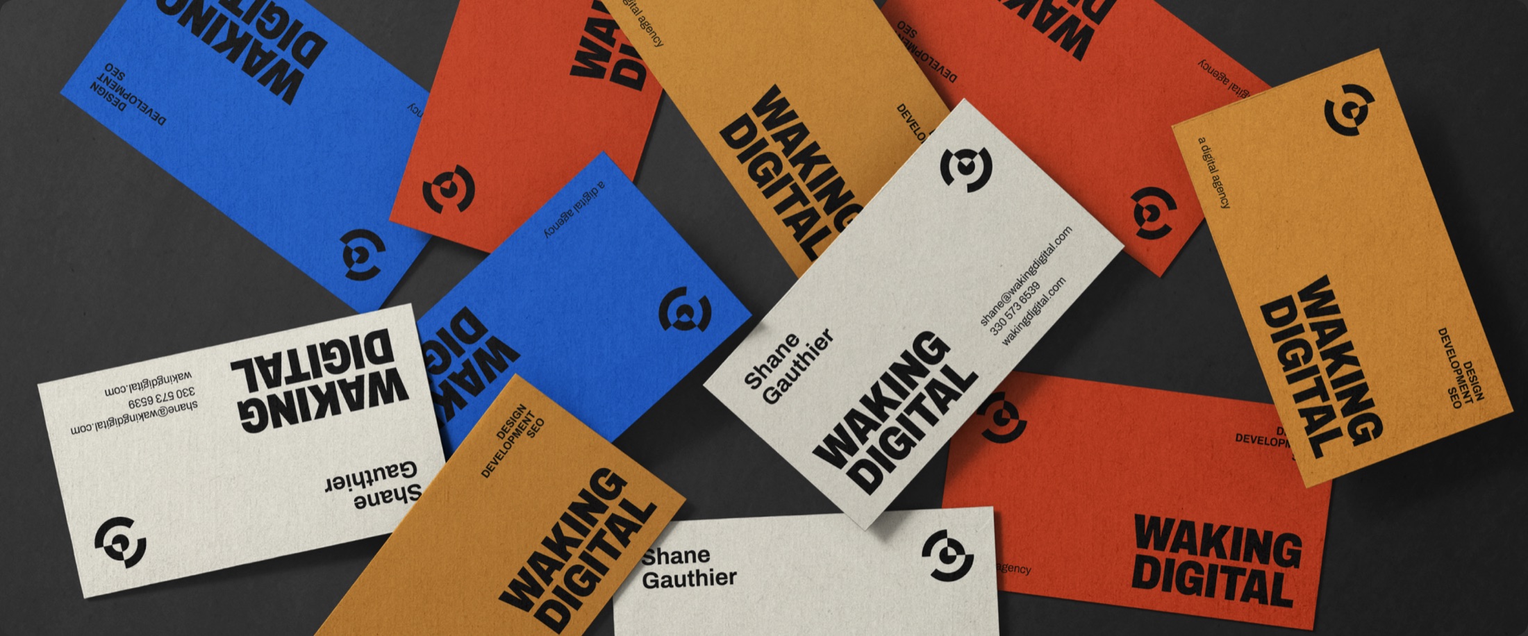
The mark carries onto merchandise in each of the brand colors.
-
 05
On the web
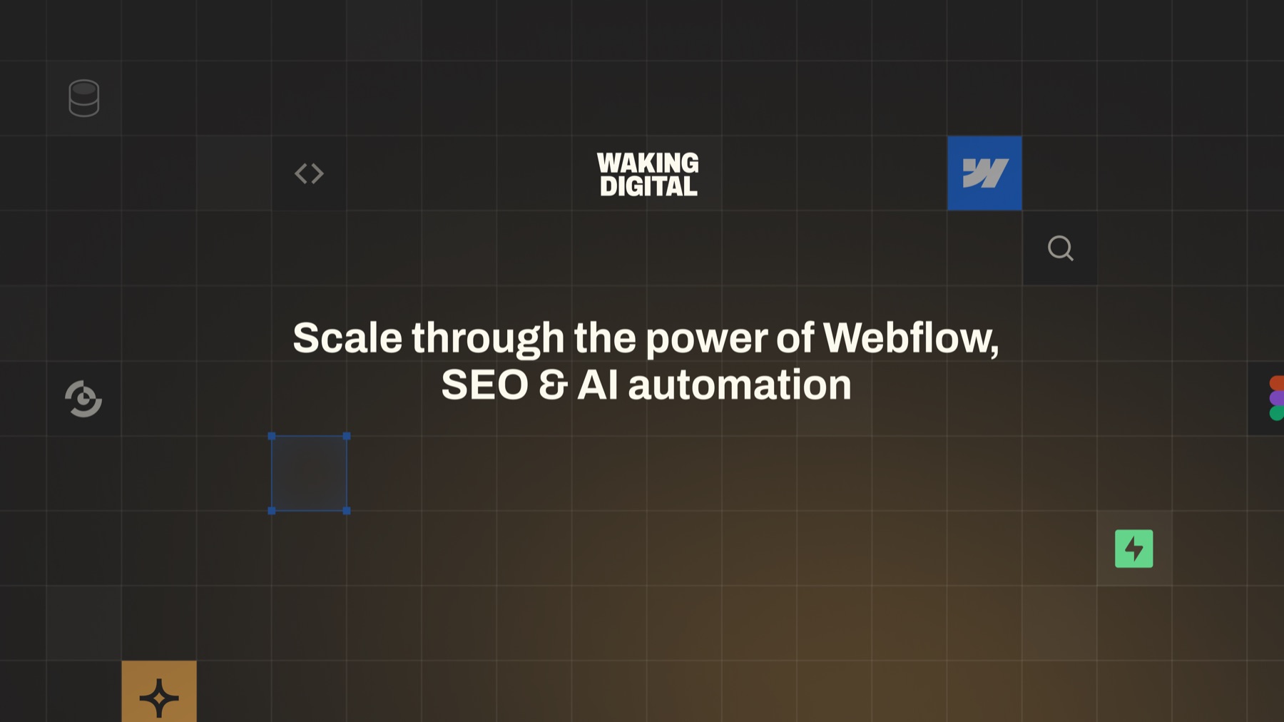
The same grid, type and colors run through the website.
- Azure #2170E7
- Hunyadi Yellow #F8AE4B
- Cinnabar #EB542B
- Ivory #FCFAEE
- Bone #E7E1D3
- Jet Black #2C2C2C
- Raisin Black #212121
Color palette
Azure blue, Hunyadi yellow and Cinnabar red complement the primary Raisin Black and Ivory, with Jet Black and Bone as secondary colors. Each accent identifies a service: blue for Webflow development, yellow for AI automation and red for SEO.
Ready when you are
Outgrown how your brand looks?
Tell us where the business is headed. We will talk through what the identity needs to do and what it would take to build it.
15 minutes. No hard sell.